Why books and periodicals need redesigning?
Books and periodicals play an important role in our lives. Yet they are the unfortunate ones who have hardly undergone any design changes since their inception. Perhaps their importance in our lives is the main reason for them not to have undergone any design change—quite like the people who are always around and we take them for granted. Till recently, they have been treated as essential items of necessity for which matters like usability and aesthetics do not matter. But this might be the one big reason why they are facing the danger of extinction in the digital era.
Let’s take examples of some designs of books and periodicals:

19th century book

21th century book

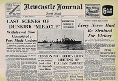
Newspaper in 1950’s

Newspaper in 2013

Magazines in 1950’s

Magazines in 2013
From these pictures it is more than evident that publishing houses never really bothered about changing the designs. But now in the digital era where Amazon is already selling more e-books than printed ones and where more and more people are shifting everyday towards digital mediums like internet and television, the battle for survival for printed materials is becoming tougher. I think at least now the publishing houses should focus on bringing some aesthetics and usability into their designs to attract the digital consumer. Otherwise soon the day might come when printed books and periodicals will be a part of history just like the living species that do not undergo any evolution and resist the change just vanish one day. Publishing houses now need radical surgery to keep the printing alive and to keep themselves afloat. So, don’t be surprised if in the near future you see some drastically differently designed and aesthetically brilliant books and periodicals in stores around you.


