Way-finding: A first timer’s cross-check
As a first time visitor to a new place, it is not uncommon to lose one’s way around, especially if one is not familiar with the context. Whenever a new system, place or context is introduced, providing a seamless user experience becomes the top benchmark of its success. It becomes even more significant in scenarios where a huge population has to access the place/system for a functional purpose.
Efficient way-finding systems become highly important in this regard. Correct orientation and ease of choosing a path within a built environment tends to highly influence a user’s satisfaction level.
Somehow, the very first interaction of a novice user can give good insights into the blocks encountered. E.g. Finding one’s way in a new city, visiting an airport or a shopping mall for the very first time. Lack of familiarity with the context is an excellent testing ground to benchmark with.
This reminds me of some of my first time interactions with places. If the aim itself is to wander aimlessly which usually isn’t, way finding can really make or mar one’s experience.
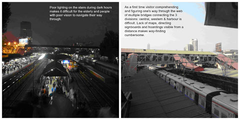
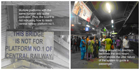
In particular, my first visit to Dadar local train station felt similar to solving a labyrinth:

At Dadar local train station

Despite crossing the Dadar junction multiple times, whenever I need to board a different local from another platform, I have to resort to asking around for directions. Though people who have been travelling through local trains for ages have become accustomed to the lack of proper maps and directions, instead memorizing the routes and platform numbers by heart comes to them as second nature.
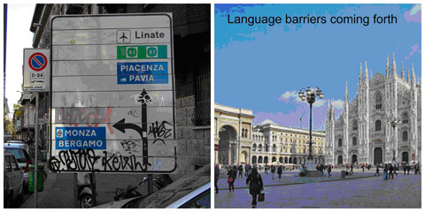
Another anecdote is from my first time experience of way-finding in Milan without a map. Though its almost impossible to lose one’s way with a Milanese map, but the situation becomes tricky when you have lost your map for instance. From the signboards, hoardings to building names, Italian is the only language of access. Asking around does not help either as localites don’t understand English. How are international travelers going to figure things out in the international business district that is Milan? For one, road signs in themselves are not efficient enough to guide a foreigner.

A signboard in Milan (left), Duomo central plaza (right)
From Mumbai to Milan, though the challenges encountered are quite different in nature, it sheds light on the complex nature of designing fool-proof wayfinding methods and devices, especially while addressing a large facet of population which is diverse in its background & culture.
Hence while designing interfaces and communication systems, certain things become indispensable to be looked into:
- Coherence of communication
- Signs and symbol designed to overcome language & cultural barriers
- Ease of accessibility to way-finding tools
- Information available on different mediums and formats to ensure the user finds directions relevant to his task
And last but not the least, a cross-check with a first timer who has never been exposed to similar systems beforehand and comes from a completely unrelated background becomes significant.
If a first timer is able to use a system intuitively without apprehension, it’s a success!


